Helping coaches to create programs 56% faster & be aware of the athletes
O2X is a human performance company that helps tactical teams and first responders build physical, mental, and emotional strength through training in nutrition, sleep, stress management, injury prevention, and mental health.

Problem
Thousands of men experience infertility issues without understanding what’s happening or where to turn for help. That’s where Bastion steps in, offering guidance, support, and solutions for male infertility and more.
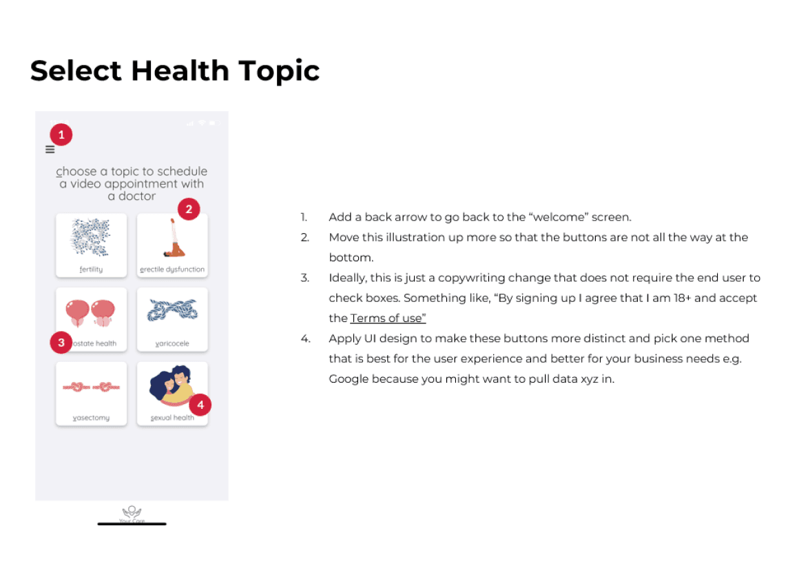
Bastion’s original app had an outdated interface and limited features, many of which added little value for users.
We were initially brought in to refresh the UI, but we quickly proposed a broader UX approach. After presenting the potential impact, the client agreed to expand the scope to include user interviews and usability testing, which led to important product improvements and better-informed decisions.
Link to app
Timeline
6 months
Services
Strategy
UX Research
Visual Design
User testing
Team
Product Owner
Business Analyst
Project Manager
Sr. UX/UI Designer
Dev Team
Marketing Lead
Role
Sr. UX/UI Designer
Goals
As a team we defined clear goals focused on improving usability, expanding product value, and aligning with business objectives:
Identify user pain points through interviews and usability testing
Improve user engagement by making features more useful
Redesign the mobile app’s outdated UI
Create a scalable design system for future
Expand the product scope to provide more meaningful value to users
Outcome
By implementing user-tested solutions, we introduced features like a guided chatbot experience, free monthly video consultations, and freemium access plans to reduce friction and increase user engagement. These updates led to a measurable impact:
14%
Increase in app downloads
Observed during the first two months post-launch, reflecting renewed user interest.
4–5
Appointments/week
Up from just 2–3 per month after implementing the free trial and improved booking flow.
+71%
User satisfaction with chatbot
Users responded positively to th echatbot feature, improving onboarding and support.
First things first
The team and I start to assemble all the possible information to start the project, from stakeholder interviews, people from different areas, know about the app.
We ran several meetings and workshop as well as different surveys and a UX audit for the old mobile app, all this to give us an idea of the project goals, requirements and, users needs, KPI’s and business goals.
Organizational Research
We started by understanding what Bastion is, along with the opportunities, goals, and metrics for the project, as well as the users.
Understanding Bastion and the project functionalities
KPI’s
The most important metrics were the number of appointments, sign-ups, app downloads, and the doctors’ ratings.
Defining success metrics for Bastion
Research and analysis of the old app
After understanding the project goals and key features, it was time to learn more about the app’s users, their needs, and analyze the old version in order to improve it.
Surveys & interviews
We designed a survey flow with several questions to better understand people experiencing infertility and gather their general thoughts. The responses helped us learn how this issue affects men’s daily lives.
Old app UX audit
I conducted a UX audit to identify issues in the app’s interface. The most common problems included a lack of consistency and poor contrast between components. The design was also missing essential elements like clear recovery from errors and well-defined features.
Testing old app
After analyzing the testing on the old app, we discovered several key insights: having only four doctors available wasn’t enough, tracking food and water intake wasn’t useful for users, they wanted to see app reviews, and some content and pricing models were confusing.
User personas
We held a workshop where we reviewed the survey results, the heuristic evaluation, and the old UI test. With this information, we developed a clearer picture of Bastion’s app users: men between 25 to 40 without children, facing fertility challenges.
Starting the ideation and design process
After analyzing the information from surveys, user testing, and reviewing the old UI, we had a discussion to define priorities and start identifying which features and flows to include or discard. Our goal was to deliver a first version that meets the users’ basic needs while staying aligned with the product’s objectives.
We began with a few initial ideas, followed by sketches and wireframes of the core features. Then we moved on to the UI and built our first prototype to put it to the test.
Old UI vs new UI
Overall, we achieved better visual consistency aligned with the brand. Both users and stakeholders approved the results. Beyond just improving the look and feel, the app became more intuitive, easier to understand, and simpler to navigate, resulting in a much better user experience.
Old User Interface
New User Interface
Creating UI screens and user flows
We moved from wireframes to the final design. After creating the screens, we developed flows to define the interaction and navigation. This helped us deliver a more consistent and easy-to-understand handoff process for the developers.
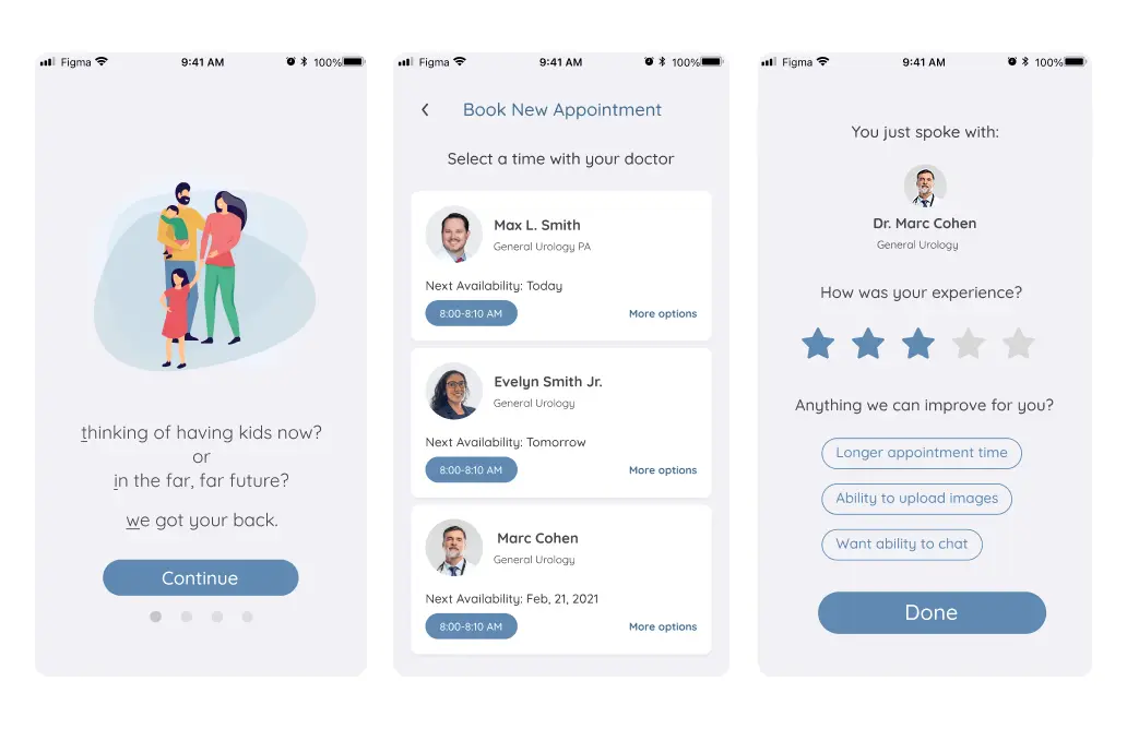
Appointment screens
One key focus was creating a better flow and experience when booking appointments. We added information to help users prepare, such as what documents to bring to the doctor. We also improved how users add information to the database and included important details about doctors to build trust with patients. Meanwhile, Bastion’s owners formed partnerships with hospitals and doctors to expand their network of specialists and grow their doctor base.
As a user I can easily book a time for a new appoinment and see consistent UI with the whole appointment flow
Aa a patient, I can easily navigate to see my upcoming, completed and missed doctor appointments
My Care screens
This flow is one of the most important, serving as the home screen where users see different options based on whether they have an active plan or not. This distinction influences how other features and screens are presented throughout the app.
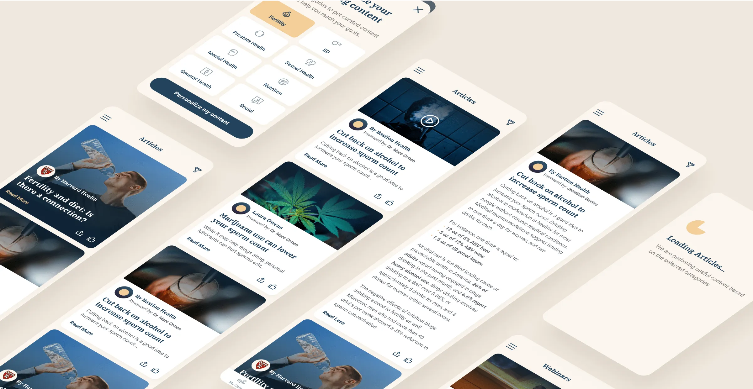
Articles and Webinars
These screens are key to building user trust and providing the necessary information to maintain good health and increase the chances of having children. Users can search for articles on various health topics and access content such as articles, videos, and webinars created by experts.
Planning the user testing
Now it is time to evaluate the design with real users to see if the app is helpful and meets their needs. We created a plan that included the goals, business objectives, tester demographics, tasks, and the testing report.
User testing plan
Testing participants
Creating tasks for the test
We carefully analyzed what we wanted to test with users and defined the most important areas of the app, such as booking doctor appointments, video calls, giving feedback, as well as understanding the plans and subscriptions. These tasks served as a strong foundation for conducting our usability testing.
Getting insights from users
In the end, we gathered all the insights and categorized them into positive and neutral feedback. The neutral points helped us identify areas for improvement in the design and screen flows. Overall, users responded positively to the UI and navigation. The main confusion came from the plans, subscriptions, and overall offer specifically whether Bastion’s services were truly worth the price.
Positive insights
We gathered valuable insights, most of which highlighted the interface's ease of use and visual appeal. Users found it simple to navigate, and they appreciated the helpful articles and information when choosing a doctor.
Tips and articles are really useful
App is simple and easy to navigate
Have schools and specialties in the doctor card is good info
UI looks cool and elegant
Interesting network of doctors
Neutral & constructive insights
The constructive feedback was related to the doctors and the plan pricing. For most users, the cost felt high, and they didn’t fully understand the real value of virtual consultations or how these could help with their health.
Want to see the real value and efficacy of doctor call and check if these are really useful
$199/month feels expensive compared to their $30 insurance copay.
Prefers doctors who ask meaningful questions about medical history, and relationships.
Doing a telemedicine call can cause mistrust and it could have some hiccups
Why won't participants use Bastion?
These participants have some experience with treatments, so they are a little bit suspicious of new fertility solutions. They’re wondering what they are going to get for $199 per month and what the benefits are.
They want to see the real value of the calls and the quality and efficacy of remote calls versus being in person with the doctor. They are also afraid of what will happen after call number 4 or 5, or what will happen after month 3, 4, etc. They are doubtful whether the monthly plan is really worth it or if other options are available.
Iteration
After user testing, we discussed several areas for improvement. These included quick, low-cost changes (low-hanging fruits), refining the business model and subscription options, improving user support, and continuing to create useful content across the app and other platforms like the website, helping reinforce the value of the product.
Looking ahead, one of the ideas in development is a physical device that will be shipped to users. This device will help measure testosterone levels and semen quality to provide more accurate health analysis. There are also plans to introduce a feature for tracking weight, physical activity, and nutrition.


Next steps
After finalizing the UI updates, completing development, and launching a few marketing campaigns, we rolled out the redesigned Bastion app. Within the first three months, we saw an increase in app downloads and a rise of 3 to 4 doctor appointments per week. This growth followed Bastion’s decision to offer a 14-day free trial with complimentary doctor calls during that period.
Looking ahead, Bastion plans to upgrade the doctors’ dashboard. However, the most exciting development is a new physical device that will be sent to users’ homes. Patients will be able to deposit a semen sample and receive a quick analysis of their sperm health and quality.
Similar projects
This was one project, there is more!
See how I’ve helped other teams improve their product experience through design.


