Building a practical design system for client products
Visual Boston is a design and development agency that helps companies design and build digital products like websites and apps.


Typography
Typography can help create clear hierarchies, organize information, and guide users through a product or experience.
Nunito Sans
Ag
ABCDEFGHIJKLMNOPQRSTUVWXYZ
abcdefghijklmnopqrstuvwxyz
0123456789 !@#$%^&*()
Use it for display, headings, tabs, etc
Fonts in gray are not used in this project
Inter
Ag
ABCDEFGHIJKLMNOPQRSTUVWXYZ
abcdefghijklmnopqrstuvwxyz
0123456789 !@#$%^&*()
Use it for buttons, body text, cards, alerts etc.
Fonts in gray are not used in this project
Display (Page Titles)
Font size: 32px / 2rem | Line height: 40px / 2.5rem
Display
Light
Display
Regular
Display
Semibold
Display
Bold
H1 (Page Titles)
Font size: 32px / 2rem | Line height: 40px / 2.5rem
H1
Light
H1
Regular
H1
Semibold
H1
Bold
H2
Light
H2
Regular
H2
Semibold
H2
Bold
H3
Light
H3
Regular
H3
Semibold
H3
Bold
H4
Light
H4
Regular
H4
Semibold
H4
Bold
H5
Light
H5
Regular
H5
Semibold
H5
Bold
H6
Light
H6
Regular
H6
Semibold
H6
Bold
Paragraph Large
Light
Paragraph Large
Regular
Paragraph Large
Semibold
Paragraph Large
Bold
Paragraph Medium
Light
Paragraph Medium
Regular
Paragraph Medium
Semibold
Paragraph Medium
Bold
Paragraph Small
Light
Paragraph Small
Regular
Paragraph Small
Semibold
Paragraph Small
Bold
X Small
Regular
X Small
Regular
X Small
Semibold
X Small
Bold
Tiny
Regular
Tiny
Regular
Tiny
Semibold
Tiny
Bold
Color
The color palette provides a unified and recognizable consistency to any project. It ensures that all visual elements align harmoniously, enhancing the overall aesthetic and reinforcing brand identity. This cohesive use of color helps create an engaging and professional look throughout your design.
Primary
The primary color palette is used across all the interactive elements such as CTA’s, links, inputs, active states, etc.
AAA 9.21
900
#0F4F58
AA 5.3
800
#167684
AA 5.2
700
#1E9EB1
AAA
600
#07272C
AAA 7.99
500
#25C5DD
AAA 7.85
400
#51D1E4
AAA 9.1
300
#7CDCEB
AAA 10.48
200
#A8E8F1
AAA 12.15
100
#D3F3F8
AAA 13.15
50
#E9F9FC
Secondary Colors
These colors serve to complement the primary color, adding depth and flexibility to the visual identity and can be use on secondary actions, buttons, links, etc.
AAA 6.63
900
#326655
AAA
800
#4C997F
AA
700
#65CCAA
AAA
600
#19332A
AAA 11.61
500
#7EFFD4
AAA 11.97
400
#98FFDD
AAA 12.41
300
#B2FFE5
AAA 12.92
200
#CBFFEE
AAA 13.52
100
#E5FFF6
AAA 13.86
50
#F2FFFB
Neutral
Neutral colors are used to provide balance and subtlety in the design. They are ideal for backgrounds, text, and borders ensuring that primary and secondary colors stand out.
AAA
900
#222C33
AAA
800
#2C353E
AAA
700
#414E5C
AAA
600
#53606D
AA
500
#8291A0
AA 6.43
400
#93A3B4
AAA 8.59
300
#AEBCCB
AAA
200
#CBD7E3
AAA
100
#E5EDF5
AAA
50
#F7FAFD
BLACK & wHITE
White is typically used for text, icons, and other key elements to ensure legibility. Black provides a clean background, creating negative space that enhances readability and highlights primary and secondary colors.
AAA
White
#FFFFFF
AAA
Black
#191F25
Transparent
These colors create overlays that focus user attention while maintaining context. They provide subtle backgrounds that dim underlying content, ensuring the primary modal content stands out.
AAA
Modal
#191F25 75%
GRADIENTS
Use gradients to add depth, dimension, and visual interest to the interface. They can enhance UI elements by creating a more dynamic look. Spinners and sliders use gradients.

Angular
#25C5DD
Linear
#25C5DD
Status colors
Status colors provide visual cues about system states: green for success or positive actions, red for errors or critical issues, yellow for caution or pending actions, and red for error status or messages.
AAA
Success
#42D864
AAA
S. Light
#ECFBF0
AAA
Warning
#EFD75A
AA 4.25
W. Light
#FDFBEF
3.03
Error
#EE645F
AAA 10.35
E. Light
#FDF0EF
Problem
As we worked with clients at Visual Boston, creating or adapting a design system for each project became repetitive and inefficient. Most existing design systems were either too generic or overly complex, with many unused components and poor long term maintenance. On top of that, Figma evolved quickly, adding features like variants and variables. We needed a flexible, modern design system template that could scale across clients, stay up to date, and improve design to development collaboration.
Timeline
+4 years
Services
Strategy
Visual Design
Design System
Team
2 Owners
1 Product Designer
Dev Team
Role
Sr. Product Designer
Goals
Creating programs more efficiently, assigning them to athletes, improving the management of organizations and athletes under the coaches' supervision, and implementing a better information architecture led to significant improvements in the web app.
Build a reusable design system that can be quickly adapted for different clients
Improve consistency across products and teams
Redesign the web app’s outdated UI
Speed up design and development workflows
Keep the system updated with new Figma features and best practices
Outcome
After years of iteration and real world use across multiple client projects, the design system became a reliable foundation for building consistent, scalable products. It reduced design overhead, improved collaboration with developers, and allowed teams to move faster without sacrificing quality. By continuously updating the system with new Figma features, it stayed flexible, modern, and easy to maintain.
75%
Faster design setup
New projects could start with a solid, ready to use foundation, cutting down the time needed to create core UI patterns and components.
+71%
Better design to dev alignment
Clear structure, documented components, and Figma variables improved handoff and reduced back and forth between designers and developers.
+61%
Consistency across products
Shared tokens, components, and guidelines helped teams maintain visual and functional consistency across different clients and platforms.
Defining the design system
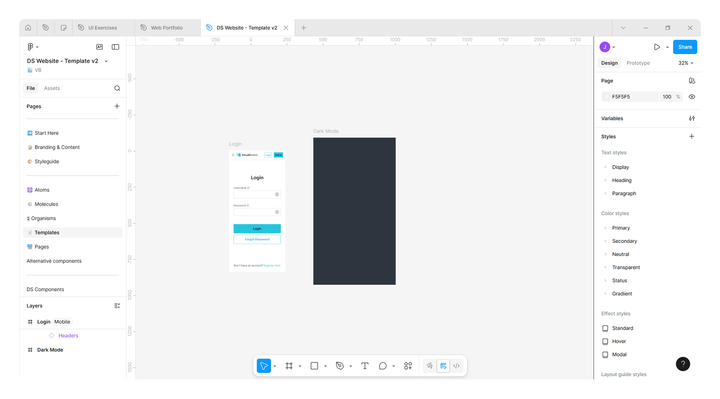
After testing several design system kits, we realized they were hard to understand for both clients and developers. They included hundreds of components that were rarely used, making adoption and maintenance more complex than necessary. Many of them were also outdated in Figma. Because of this, we decided the best solution was to build our own design system, a process that started in 2020.
Organize and structure our Design System
With all the experience and insights we gained, I took on the task of organizing and planning this design system to support our future projects. We defined the methodology, structure, styles, and components, along with clear usage rules, to make it efficient and fast to work with. Over time, we kept improving it by adopting new Figma features to make it more flexible and up to date, adding variants, variables, and design tokens.
✅ Color
✅ Elevation
✅ Layout & Grid
✅ Motion
✅ Spacing
✅ Typography
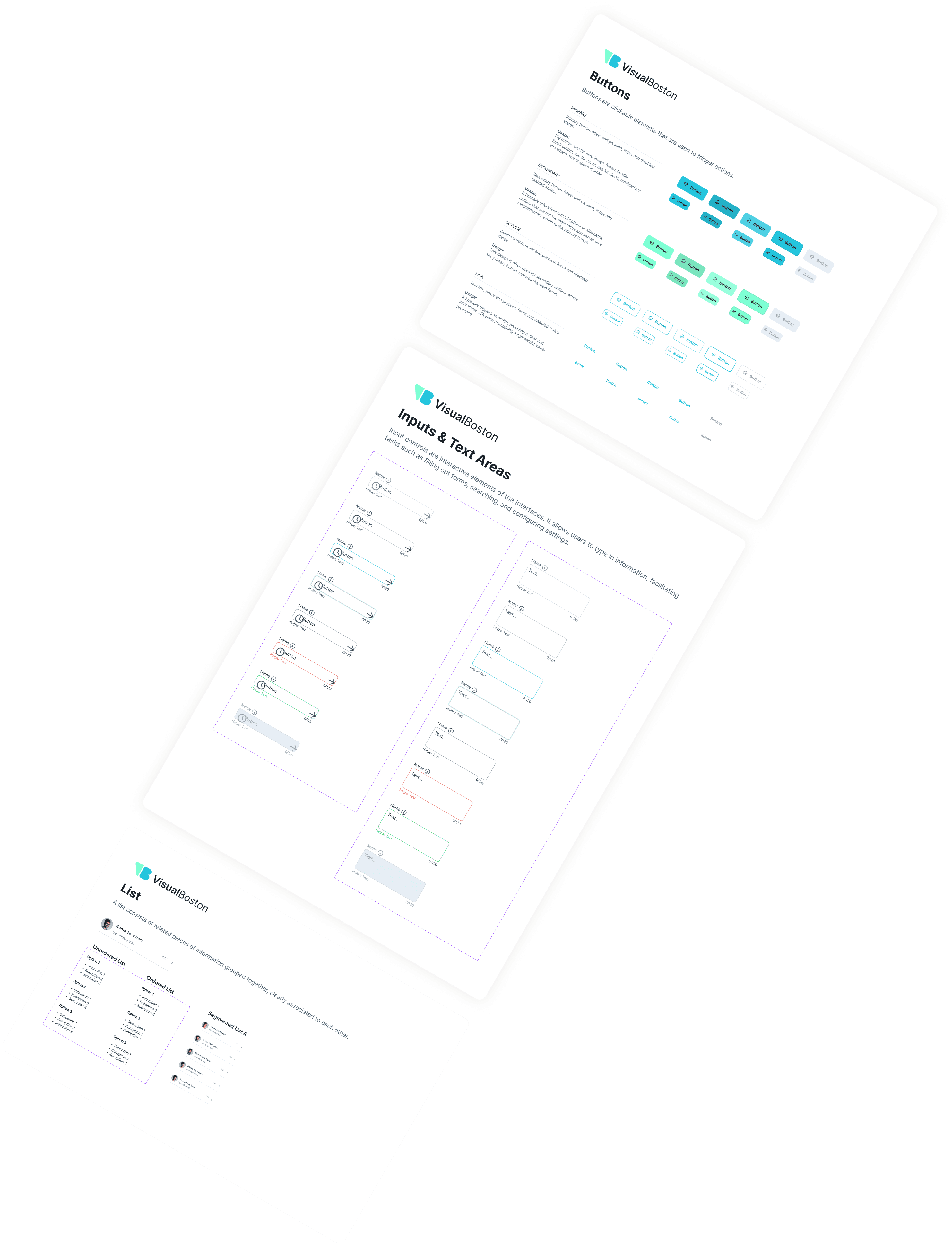
Styleguide
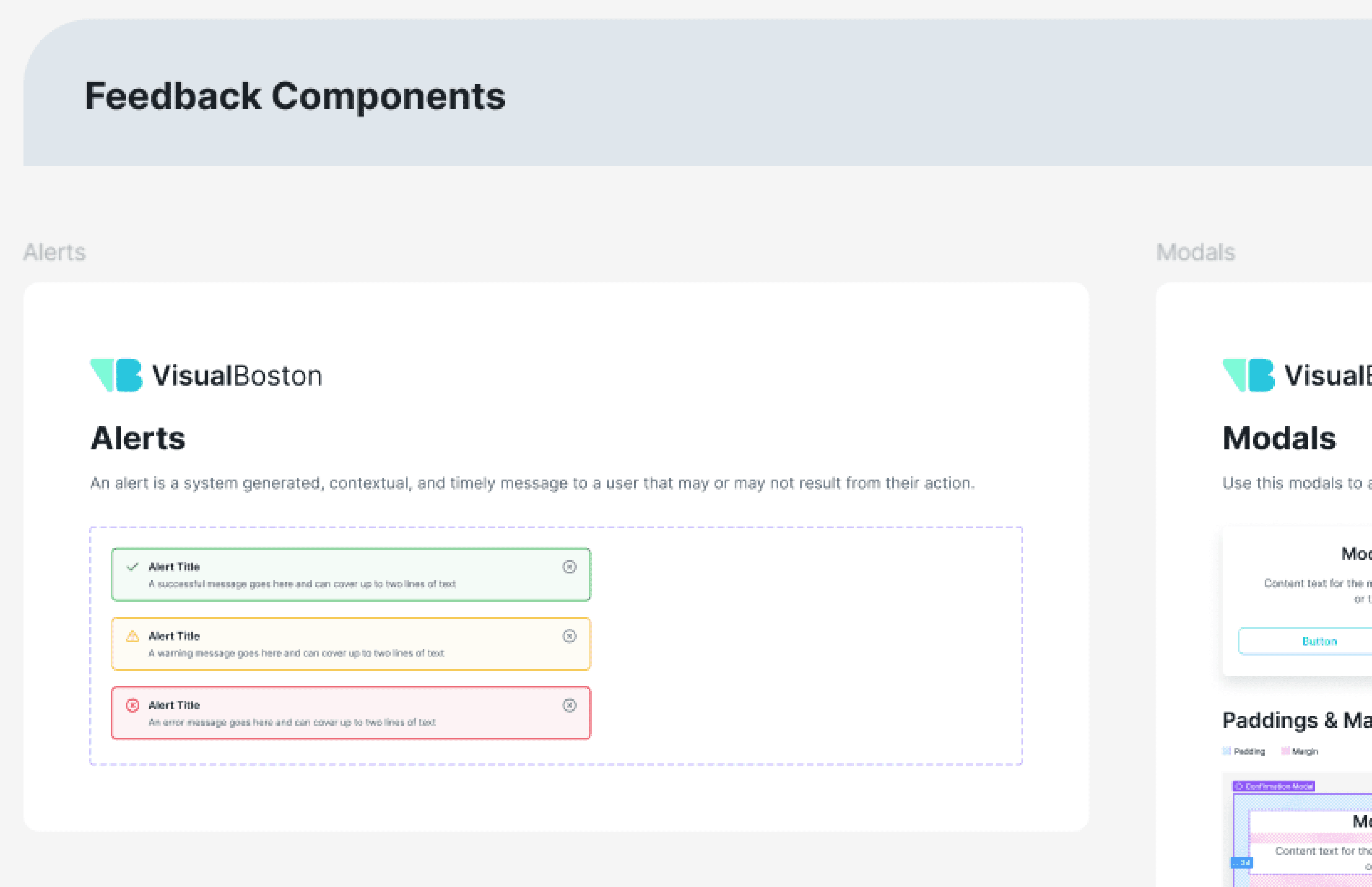
✅ Accordion
✅ Alerts
✅ Avatar
✅ Badge
✅ Banner
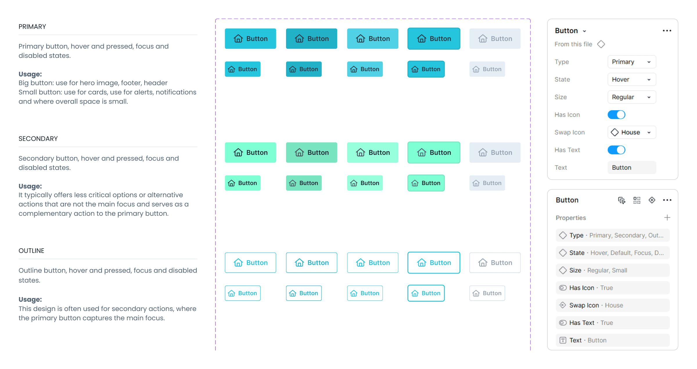
✅ Button
✅ Card
✅ Carrousel
✅ Checkbox
✅ Chat
✅ Chips
✅ Datepicker
✅ Dropdown
✅ Empty State
✅ Input
✅ Link
✅ List
✅ Modal
✅ Navigation
✅ Notification
✅ Popover
✅ Progress Bar
✅ Progress Bar
✅ Radio
✅ Slider
✅ Skeleton
✅ Spinners
✅ Table
✅ Tab
✅ Text Area
✅ Toast
✅ Toggle
Components
Organizing elements and components inside our design system.
The first attempt
Our first step was to define the base style guides, where we set branding colors, typography, spacing, shadows, and other core visual rules. From there, we organized components by functionality to keep the system clear and easy to use: navigation, data display, feedback, and forms and filters.
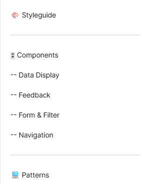
Navigation, data display, feedback, and forms and filters categories.
How variants improve our design system workflow
By implementing Figma Variants, I transitioned the system from a fragmented library of hundreds of individual components to a streamlined collection of scalable component sets. By grouping states, sizes, and hierarchies into single containers, I minimized cognitive load for the design team and established a shared language with engineering through property-based configuration.
The atomic design methodology
After testing our design system with real clients and projects, keeping up with Figma updates, and learning from courses and videos on how to improve and optimize design systems, we decided to adopt the Atomic Design methodology.
Benefits of atomic design
To ensure the system remained scalable and intuitive, I implemented the Atomic Design methodology. This structured hierarchy allowed me to break down complex interfaces into their most basic building blocks (Atoms), which were then strategically assembled into functional molecules and organisms. By categorizing components based on their complexity rather than just their name, I created a predictable mental model for the design and dev team.
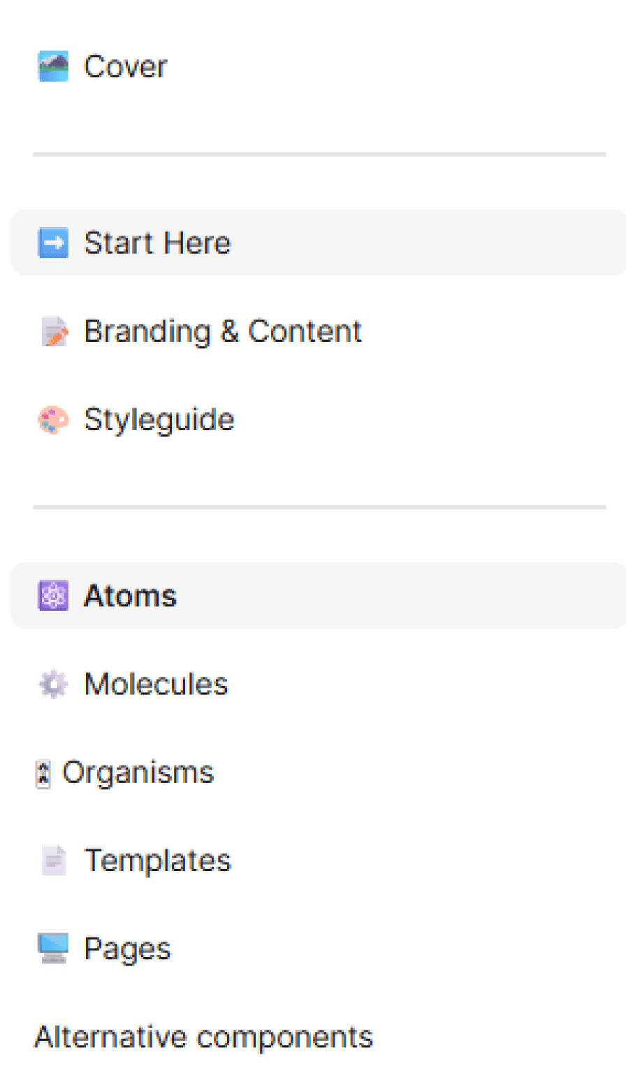
Molecules
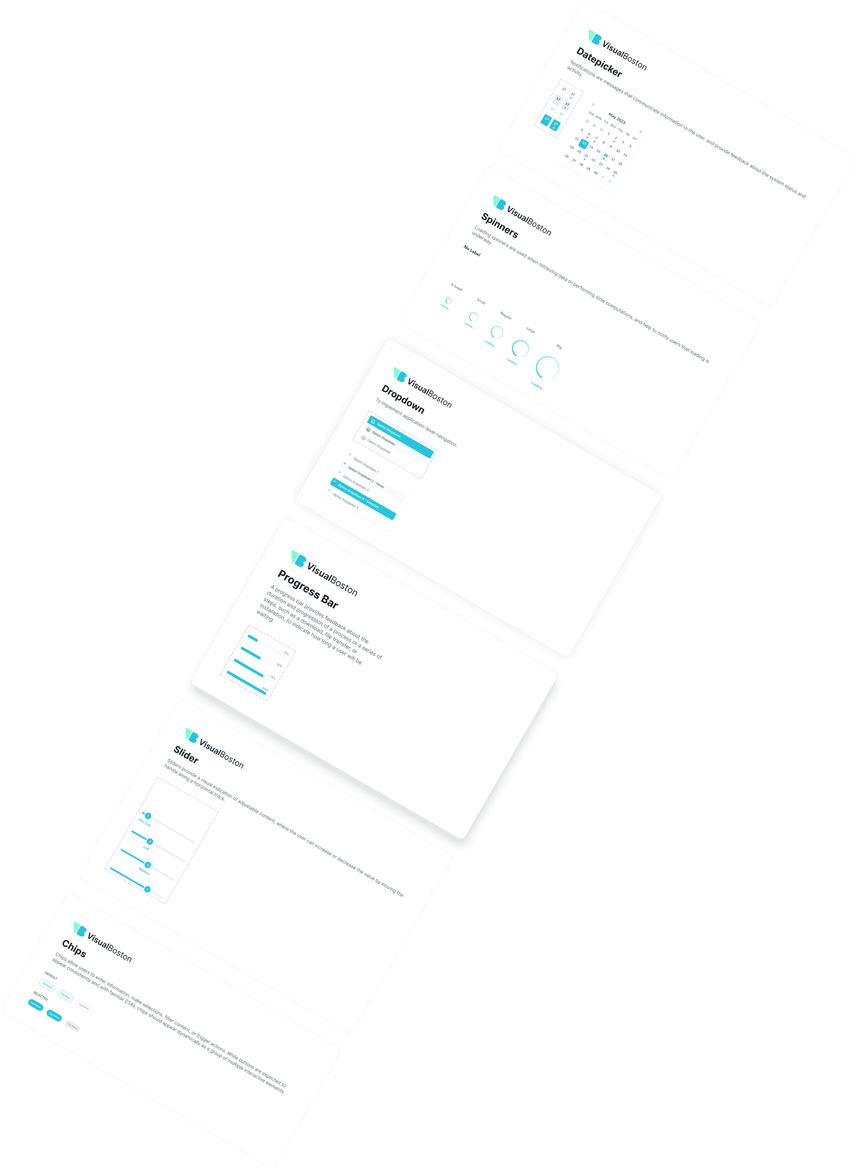
Molecules are groups of atoms bonded together that have their own unique features. They make relatively simple functions together as one.
Components: Breadcrumbs, Pagination, Accordion, Cards, Dropdown, List, Empty State, Skeleton, Alerts, Modals, Notifications, Popovers, Progress Bar, Toast, Inputs & Text Areas, Slider, Datepicker.
Alert Title
A warning message goes here and can cover up to two lines of text
Notifications

A new notification description will go here and it can take up to two lines of text.
## Minutes ago
Secondary
Primary
May 2023
SUN
MON
TUE
WED
THU
FRI
SAT
29
30
31
1
2
3
4
5
6
7
8
9
10
11
12
13
14
15
16
17
18
19
20
21
22
23
24
25
26
27
28
29
30
1
2
Option Dropdown
Option Dropdown
Option Dropdown
Defining atoms, molecules and organisms
With Atomic Design in mind, we restructured the system and reorganized components into clear categories based on their role and complexity. This made the library easier to navigate, more manageable to maintain, and faster to use for both designers and developers.
Variables and tokens, a game changer
The introduction of Variables and Design Tokens was the ultimate game changer, moving the system from hard-coded hex values and styles to a logic-driven architecture. By replacing 'magic numbers' with semantic tokens (e.g., surface-primary-default or spacing-md), I created a single source of truth that bridges the gap between design and code. This shift transformed the library into a living system where intent matters more than the value. By implementing variables for colors, spacing, padding, and responsive breakpoints, I ensured the system could adapt to any context while maintaining strict visual integrity.
Benefits of variables and tokens
Investing time upfront in variables paid off by replacing manual work with automated logic. While the setup required more initial effort, it eliminated the need for manual updates and duplicate mockups. Now, global changes to colors or spacing sync instantly across the entire system, ensuring the design remains cohesive as the product scales without adding technical debt.
Instant Adaptability: Seamless transitions between color modes and responsive breakpoints.
Unified Language: No more "magic numbers" during dev handoff.
Semantic Logic: Clear naming to avoid the clutter and ambiguity of raw values.
Scalability: Radical reduction in long-term design debt.
Last, but no less essential
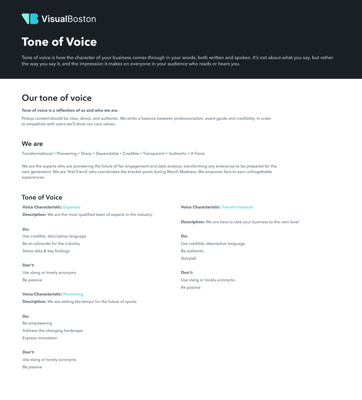
Another important addition was the design system guidelines. We documented how to use the system, the methodology behind it, and clear explanations of variants and variables and how they should be applied. This helps clients, new designers, and developers understand how the system works once it is done and delivered and how to use it correctly.
We also included a dedicated branding section with information about the product and company, such as vision, values, content guidelines, tone of voice, microcopy, and accessibility principles.
Key Takeaways
After the testing report, I focused on quick UI improvements. While front-end development continued, I supported the dev team with handoff, helped with implementation, and built a scalable Design System to keep the app consistent over time.
A few months after launching the new version, we received feedback and metrics from both stakeholders and coaches. The new UI and overall experience received over 80% approval from coaches. They mentioned they can now create and duplicate programs much faster, reporting they now build programs in hours instead of days. They also feel more connected to their athletes and are better able to track progress and performance through the improved dashboard.
Similar projects
This was one project, there is more!
See how I’ve helped other teams improve their product experience through design.


